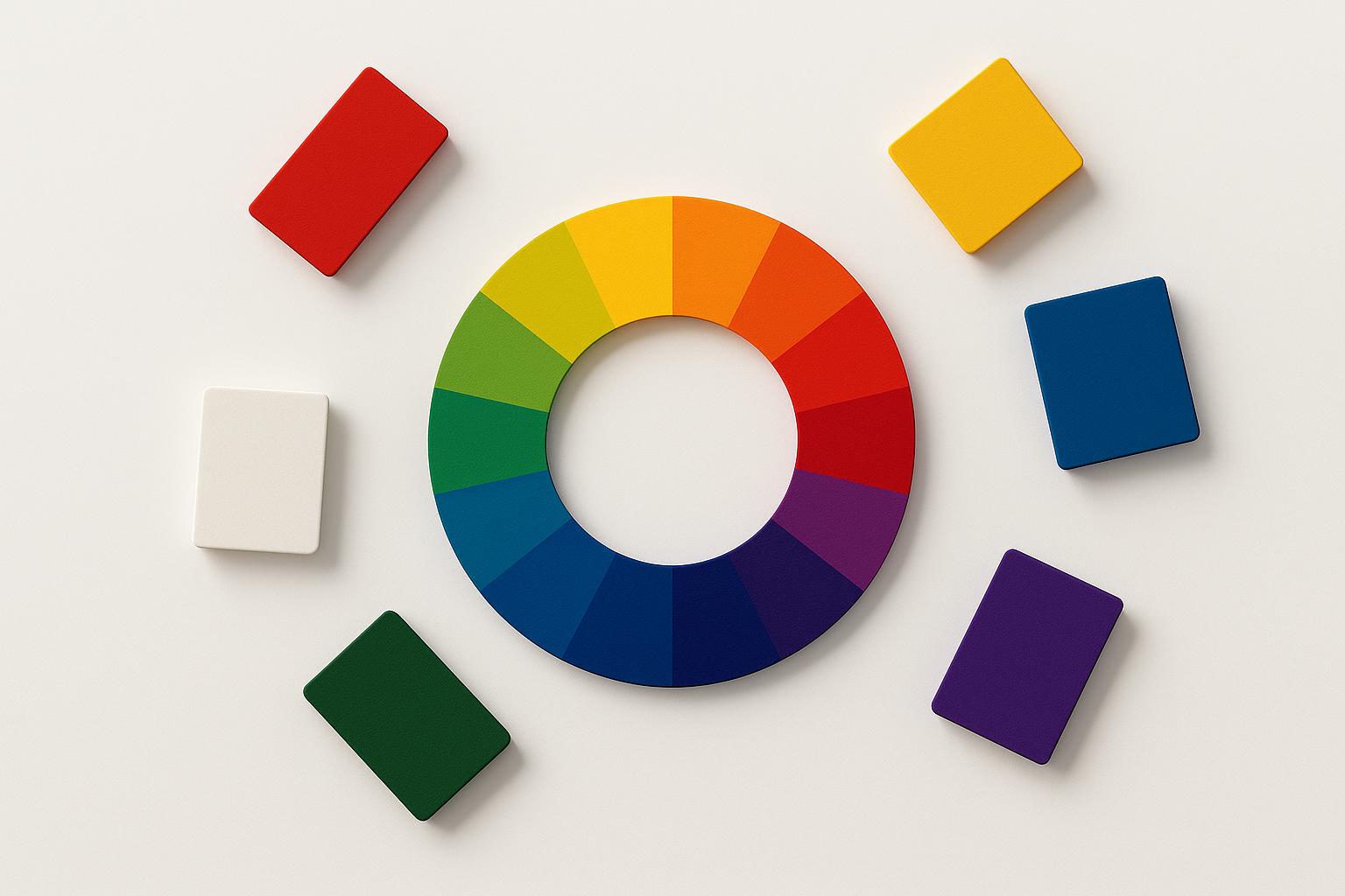
The paradox of choice is one of the most replicated findings in consumer psychology, and one of the most expensive for marketing teams to ignore: beyond a surprisingly low threshold, offering customers more options doesn’t increase sales — it actively reduces them. You’ve felt it yourself: you walk into a supermarket for olive oil, spend four minutes comparing labels, and walk away frustrated, sometimes without buying anything at all. That isn’t a personal flaw. It’s a predictable outcome of how the human brain handles too many options — and for SMEs, designing around it is a competitive advantage most leave on the table.

The Science Behind the Paradox of Choice
In 2000, psychologists Sheena Iyengar and Mark Lepper ran a now-famous experiment at a California grocery store, published as “When Choice Is Demotivating” in the Journal of Personality and Social Psychology. On alternating days, they set up a tasting booth for jam — sometimes displaying 24 varieties, sometimes just 6. The large display attracted more browsers. But the small display converted dramatically better: around 30% of customers who saw 6 jams made a purchase, compared to roughly 3% of those who saw 24. Fewer options produced ten times the sales.
The mechanism is cognitive load. The prefrontal cortex — the brain’s decision-making centre — has finite processing capacity. When it faces too many options, it experiences decision fatigue: the quality of decisions deteriorates and the brain defaults to its lowest-energy response, which is to make no decision at all. Every option you add forces your customer’s brain to run a comparison process it didn’t sign up for.
There’s a second mechanism at work: anticipated regret. When there are 24 jam varieties, choosing one means implicitly rejecting 23 others. The brain simulates potential regret for each unchosen option, and that simulated regret — felt before the purchase — is often enough to trigger avoidance entirely. With 6 options, the comparison is manageable and the regret calculus is simple.

How the Paradox of Choice Shows Up in Your Marketing
The jam experiment plays out in slow motion on SME websites and sales processes every day. The most common places the paradox of choice quietly kills conversions:
Pricing pages with too many tiers. The instinct is to offer maximum flexibility — Basic, Standard, Professional, Enterprise, Custom. In practice, customers confronted with five price tiers frequently leave without choosing any. Pages with three options, one of them visually emphasised as recommended, consistently outperform longer menus.
Product catalogues without hierarchy. If every product on your site looks equally important — same size, same visual weight, same amount of copy — visitors have no signal telling them where to start, and the brain defaults to inaction.
Service menus that list everything. Consultancies, agencies, and professional service firms often list every service they offer on a single page, hoping breadth signals capability. What it actually signals is complexity — and complexity triggers avoidance.
Navigation with too many items. Every additional item in your menu is a micro-decision your visitor makes before they’ve even started reading. Fewer, clearer navigation choices reduce friction at the very first touchpoint.
The Optimal Number: What the Research Says
George Miller’s classic 1956 paper, “The Magical Number Seven, Plus or Minus Two”, established that working memory comfortably holds five to nine items. But for purchase decisions, the sweet spot is closer to three. Three options create what behavioural economists call the compromise effect — given a low, medium, and high option, most customers gravitate toward the middle, which is typically the option the seller most wants to sell.

This is why the best-performing pricing pages show three plans with the middle tier highlighted as “Most Popular.” It isn’t manipulation — it’s removing the cognitive friction that prevents customers from making any decision at all. The middle option gives the brain a clear anchor and a way to feel it made a reasonable, non-extreme choice.
If you genuinely need more than three options — in a product catalogue, for example — the solution is hierarchy, not reduction. Group offerings into three or four clear categories. Let customers filter their way to a smaller subset. Never force the brain to compare everything at once.
Applying the Paradox of Choice to Your Business
Audit your conversion bottlenecks. A high exit rate on your pricing or services page is often a sign of choice overload, not price resistance. Before cutting prices, try cutting options.
Create a recommended path. Explicitly tell customers what most people in their situation choose. “Our most popular option for growing service businesses” reduces the decision burden and activates the social validation shortcut at the same time.
Remove options strategically. If you offer a service you rarely sell, take it off the menu. It isn’t contributing revenue — it’s diluting everything else you offer and taxing every visitor who reads the page.
Use contrast, not similarity. When you keep multiple offers, make sure they differ clearly in scale and benefit — not just price. If two options feel similar, customers stall trying to tell them apart. Each option should serve an obviously distinct customer or need.
Test fewer options. If you currently run five pricing tiers, try three for the next 90 days and measure conversion rate, not preference. Most businesses find that reducing choice increases both conversions and average order value — because customers who were overwhelmed now have a clear path to purchase.
Perceived Variety vs. Actual Variety
There’s a crucial distinction between perceived variety and actual variety. Customers want to feel they have options — that the brand understands their individual needs. But they don’t want to do the work of evaluating every configuration themselves.
The solution is guided choice: a recommendation quiz, a “most popular” filter, or a simple intake conversation that gives customers the feeling of personalisation without requiring them to compare 24 jams. This is why Netflix’s “Because you watched…” row gets you watching faster than browsing its full catalogue of thousands of titles, and why Spotify’s Discover Weekly feels effortless. For SMEs without algorithm budgets, the equivalent is a discovery call or a one-question guide on your website: “If you’re an X-type business, start here.” It’s the human version of guided choice, and it converts dramatically better than presenting everything at once.
This works because the buying brain runs on fast, automatic judgments far more than careful deliberation — what Daniel Kahneman called System 1 thinking. Our guide on System 1 and System 2 in marketing explains why reducing cognitive effort is usually worth more than adding persuasive arguments.
The Neuroscience Bottom Line
Every option you add to your offer is a cognitive tax on your customer’s decision-making capacity. Beyond three to six options, you’re not increasing appeal — you’re increasing the likelihood they walk away with nothing. The brands that understand the paradox of choice don’t compete on variety. They compete on clarity: making the right choice feel obvious, low-risk, and easy.
In marketing, this is a lever that costs nothing to pull. Fewer, clearer options mean less hesitation, fewer abandoned carts, fewer “I need to think about it” responses — and more customers who arrive at the decision you hoped they’d make, feeling like it was their idea all along.
Choice architecture is only one part of how customers experience your brand. Read our guide on sensory marketing — how sound, scent, and touch shape buying behaviour before logic gets involved.