You have 0.05 seconds. That is how long it takes a visitor to judge your website — before they read a single word. Understanding the neuroscience of website first impressions is no longer a luxury for SMEs competing online. It is the difference between a visitor who stays and one who bounces, often never to return.
In this post, we break down what happens in the brain during those first milliseconds on your site. We look at what research tells us about digital first impressions. And — most importantly — we share the practical design principles you can apply right now.

What the Neuroscience of Website First Impressions Actually Tells Us
The landmark research comes from a 2006 study in Behaviour & Information Technology by Gitte Lindgaard at Carleton University. Researchers found that website first impressions form in as little as 50 milliseconds. Visitors rarely revise that initial judgment — even after spending more time on the page.
Neuroscientists call this the halo effect in digital environments. Once the brain labels a site as trustworthy or untrustworthy, it filters everything else through that lens. A visitor who forms a negative first impression will find reasons to confirm it. A positive one makes them more forgiving of minor flaws.
The brain region driving this response is the amygdala — the brain’s threat-detection system. It evolved to assess physical safety in milliseconds. Now it applies the same rapid-fire evaluation to digital environments. Is this safe? Is this credible? Does this belong to my tribe? Your website design answers all three questions before your headline does.
Stanford’s Web Credibility Research found that 75% of consumers judge a company’s credibility based on website design alone. For SMEs, your website is not just a marketing channel. It is your most powerful trust-building asset — or your biggest liability.
The 0.05-Second Brain: What It Is Actually Evaluating
In those first 50 milliseconds, the visual cortex processes your entire page as a whole. The conscious brain has not parsed a single element yet. Research by Nielsen Norman Group shows users spend an average of 10–20 seconds on a page before deciding to stay or leave. But the emotional verdict arrives far sooner.
The brain evaluates five signals simultaneously in that window:
Visual complexity. Cluttered pages signal threat or effort. The brain defaults to conserving energy — a busy design triggers avoidance. Google’s own research confirmed it: people consistently rate visually complex websites as less trustworthy than simpler ones.
Visual familiarity (prototypicality). The brain compares your site to its stored template of a credible website in your category. Sites that deviate too far from those norms feel untrustworthy — even if they are objectively more beautiful. Radical design innovation carries real risk for conversion-focused sites.
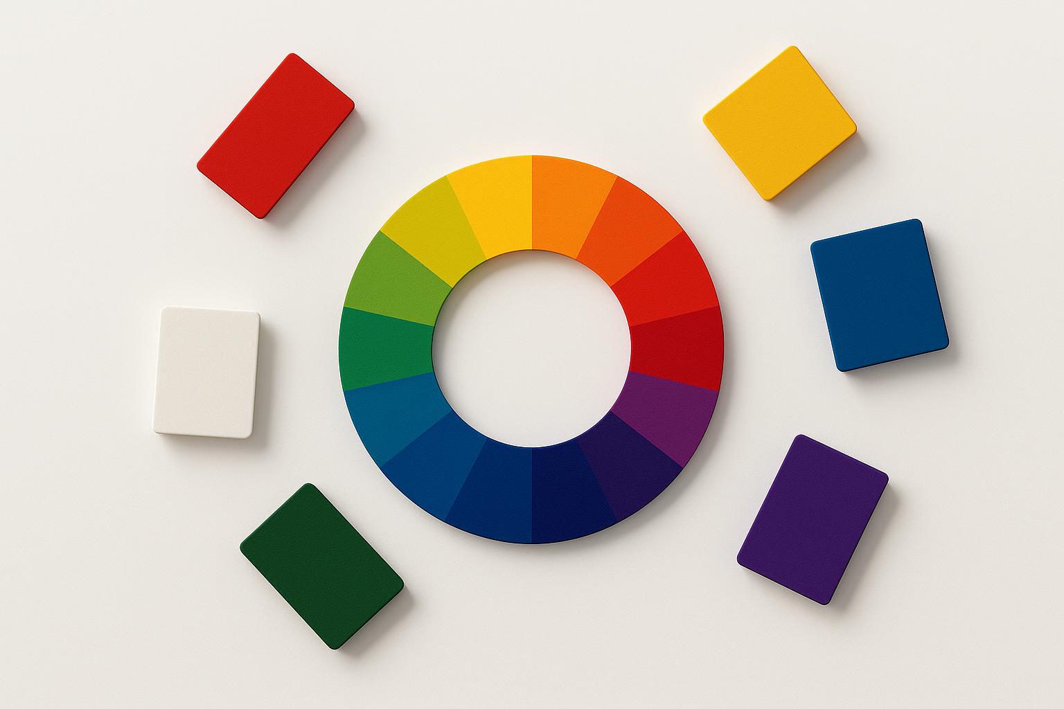
Color and contrast. As we explored in our post on the psychology of colors in branding, the limbic system processes color before conscious perception. The right palette creates an immediate emotional signal of trust and competence.
Visual hierarchy. The brain scans for one clear entry point. No dominant headline, hero image, or call to action? The visual cortex registers disorder. The amygdala reads that as a signal to disengage.
White space. Adequate spacing between elements reduces mental effort and raises perceived quality. Apple has built its entire visual identity on this principle — generous white space signals premium, confidence, and clarity.

Real Brands That Engineered Their Website First Impressions
The best brands never create strong website first impressions by accident. They engineer them deliberately, based on how the brain actually processes what it sees.
Airbnb redesigned their homepage in 2014 around one full-bleed photograph of an aspirational destination. Visitors felt desire and belonging before they read a word. Bookings rose significantly. The insight was simple: the brain’s emotional response to imagery shapes rational thinking — not the other way around.
Dropbox launched with one headline, one illustration, and one button. In an era of feature-heavy SaaS pages, cognitive ease made them stand out. The brain reads simplicity as confidence. If a company is that clear about what they do, they must be good at it.
Squarespace built their brand around one idea: beautiful design for everyone. Their own website demonstrates their product’s output. Every first-time visitor’s immediate aesthetic reaction is the value proposition. The first impression IS the pitch.
Amazon takes the opposite approach — dense, information-rich layouts that signal choice and value. It works because Amazon’s visitors arrive ready to buy, not to browse. Their design targets the neurological state of a buyer, not an explorer.
The lesson for SMEs: your ideal website first impression is not Amazon’s or Apple’s. It is the one that matches your visitor’s emotional state at the exact moment they land on your site.
5 Practical First-Impression Principles for SME Websites

You do not need a Fortune 500 budget to engineer a powerful first impression. These five neuroscience-backed principles improve your website first impressions immediately — and most cost nothing to implement.
1. Lead with a single dominant visual. The brain needs one clear entry point. One strong hero image or one powerful headline — not both competing at once — anchors the visual cortex and signals confident thinking.
2. Communicate your value proposition above the fold. Research shows 57% of users’ viewing time happens above the fold. Your visitor’s brain must answer “what is this and is it for me?” without scrolling. If it cannot, you have lost the window.
3. Eliminate visual noise ruthlessly. Every element on your page competes for attention. An extra colour, a redundant widget, a stock photo that adds nothing — each one raises cognitive load. Cut anything that does not serve your visitor’s first-impression journey.
4. Use social proof immediately. Client logos, review counts, credentials, and media mentions activate the brain’s social validation system. Placed above the fold, they answer one implicit question: “do people like me trust this?” That answer converts neutral impressions into positive ones.
5. Make the next step obvious. Decision fatigue sets in fast. One button, one direction — that is all. Multiple competing CTAs divide attention and dilute conversion.
The First Impression Is a Brain Event, Not a Design Choice
Website first impressions are not about aesthetics. They are about the brain’s threat-assessment system making a credibility judgment before your content can speak.
For SMEs, every design decision is a neurological input. Your colour palette, your hero image, your layout density, your use of white space — each one either builds trust or erodes it in the first 0.05 seconds.
The good news: implementation does not have to be expensive. A focused homepage redesign, a cleaner visual hierarchy, and one compelling hero image can transform your results. The brain does not care how much you spent. It cares whether you answered its rapid-fire questions with clarity and confidence.
Audit your homepage today as if you were seeing it for the first time. Is the first impression you are creating the one your ideal customer needs to feel in order to stay?
Want to understand more about how neuroscience shapes customer decisions? Read our guide on building brand trust through storytelling — another powerful lever that works alongside first-impression design.